
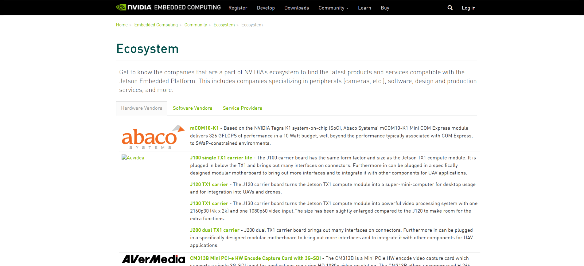

One of my first major projects upon joining NVIDIA as a Web Developer on the Embedded Systems Marketing team was to help redesign their Ecosystem page.
The existing page was largely static and, as a result, not scalable for the rapidly growing number of partners and affiliates within the product ecosystem. This made it difficult for developers (our primary users) to find the information and products they wanted without sifting through a massive wall of text, which in turn resulted in a poor click-through rate and a high bounce rate as users gave up on trying to find what they were looking for.
First things first, we added a search bar. Revolutionary, I know. But a simple search function goes a long way in enabling developers to find exactly what they want.
As for the listings themselves, we wanted to offer a snapshot not only of the ecosystem entities, but of their products and services as well. I went through several iterations – nested accordion menus, mixed accordions and tabs, and others that honestly, I just don’t remember anymore (it was a long time ago). Specifically, I was attempting to work with the existing bootstrap elements I had access to, which somewhat limited my options, but that was the task at hand.
The higher-ups liked the nested accordions as an interim solution, but also granted our team the resources to develop something more bespoke for the future.
Coordinating with the backend team, we figured out what was feasible and settled on a “chip” system wherein each entity would have a chip that, when clicked, would display its offerings as individual chips. Clicking on these chips would take the user to the appropriate page. Each sub-chip would also have tags associated with it, allowing us to expand the search bar to filter by tags, and to give the user a better idea of what the product was at a glance. Condensing each company into a single, relatively small chip resulted in the added bonus that dozens of companies could be displayed above the fold, rather than just two or three.
The result? A massively increased click-through rate and lowered bounce rate, and a dynamic, scalable display that could handle way more entities and offerings than before.
The page has gone through further iterations after my time at NVIDIA, so unfortunately what exists now isn’t illustrative of my work. But thanks to the Wayback Machine, we have pictures!