



My latest game development project, Try Not to Burn Up on Reentry, is a cooperative puzzle game inspired by the hit party classic, Keep Talking and Nobody Explodes. The basic idea is pretty simple: one player is in the cockpit of a spaceship, trying to land it. The other player (or players) have a “User’s Manual” that says how to solve each puzzle. They can’t see the cockpit, and the pilot can’t see the manual. Everyone has to communicate with each other to work through each puzzle as they arise in order to land safely.
This type of game, especially one with an entirely diegetic interface, presents an interesting challenge. On the one hand, the player in the cockpit requires a UI that promotes exceptional situational awareness so they can focus on what puzzles have to be solved, when, and how. But the diegetic interface means that it all has to fit into a form factor that looks reasonably like an actual cockpit, including all the visual detail and effects, without being distracting or difficult to navigate.
Likewise, the players with the User’s Manual must be able to navigate to the correct page, read the instructions, and comprehend the diagrams. But since this is a puzzle game, it can’t be perfectly straightforward. The manual must be purposefully difficult to decipher, but not unreasonably obtuse.
The pilot’s view solves these issues in a number of ways. Each puzzle module has a bright light and alarm that can alert the player that the puzzle needs to be solved, even if their attention is currently focused elsewhere. A backup alert flashes on the central screen – the default position they will typically return to after solving a puzzle – to remind them if there are any other active puzzles.
In the User’s Manual, navigation is meant to be simple and straightforward, and is facilitated by nested headers that allow the player to quickly jump between different topics. Each page also saves its state (such as which stage of a puzzle the player has selected) to reduce the number of clicks (and therefore save valuable time) if the player has to temporarily go to a different page.
Difficulty for the player with the User’s Manual presents in several ways. First is purposefully misleading language. For the “Loose Wiring” puzzle pictured above, the diagram is relatively straightforward, but requiring the player to specify whether the wires should be assigned based on position or label can cause miscommunication between players, since both positions and labels can be called by the numbers 1-4.
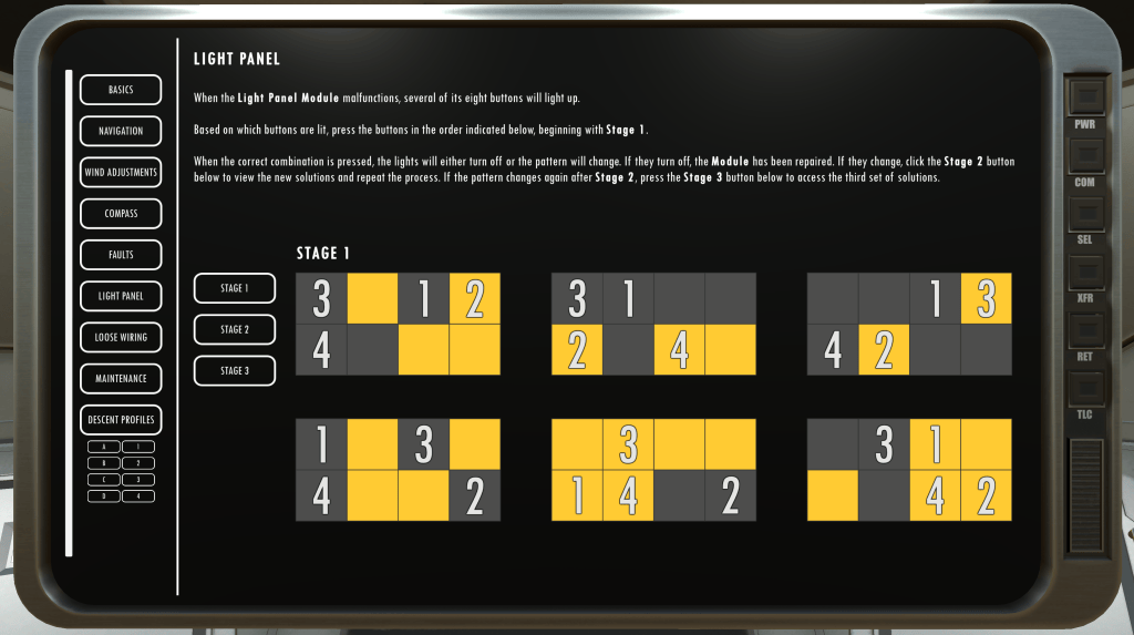
Similarly, in the “Light Panel” puzzle, the numbers presented onscreen are meant to trip up the player by conflating the numeric positions of lights with the numbers that indicate the order in which they should be pressed. Sort of like trying to say the color of text that spells “green”, but is colored orange.
Is it confusing? Yes. But I’m happy to report that my playtesters have consistently been confused in the ways that are intentional, and have yet to be stymied by the interfaces themselves. That’s a balancing act I’m quite proud of.